以下是 jQuery+css3圆形倒数秒计时器代码 的示例演示效果:
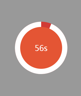
部分效果截图:
HTML代码(index.html):
<!DOCTYPE html PUBLIC "-//W3C//DTD XHTML 1.0 Transitional//EN" "http://www.w3.org/TR/xhtml1/DTD/xhtml1-transitional.dtd">
<html xmlns="http://www.w3.org/1999/xhtml">
<head>
<meta http-equiv="Content-Type" content="text/html; charset=utf-8" />
<title>jQuery+css3圆形倒数秒计时器代码</title>
<script type="text/javascript" src="js/jquery.js"></script>
<script type="text/javascript" src="js/time_js.js"></script>
<link type="text/css" rel="stylesheet" href="css/time_css.css" />
</head>
<body>
<div class="game_time">
	<div class="hold">
		<div class="pie pie1"></div>
	</div>
	<div class="hold">
		<div class="pie pie2"></div>
	</div>
	<div class="bg"> </div>
	<div class="time"></div>
</div>
<script type="text/javascript">
countDown();
</script>
</body>
</html>
JS代码(time_js.js):
// JavaScript Document// Date:2014-11-07// Author:Agnes Xui = 0;
	j = 0;
	count = 0;
	MM = 0;
	SS = 60;
	// 秒 90sMS = 0;
	totle = (MM+1)*600;
	d = 180*(MM+1);
	MM = "0" + MM;
	var gameTime = 60;
	//count downvar showTime = function(){
	totle = totle - 1;
	if (totle == 0){
	clearInterval(s);
	clearInterval(t1);
	clearInterval(t2);
	$(".pie2").css("-o-transform","rotate(" + d + "deg)");
	$(".pie2").css("-moz-transform","rotate(" + d + "deg)");
	$(".pie2").css("-webkit-transform","rotate(" + d + "deg)");
}
else{
	if (totle > 0 && MS > 0){
	MS = MS - 1;
	if (MS < 10){
	MS = "0" + MS}
;
}
;
	if (MS == 0 && SS > 0){
	MS = 10;
	SS = SS - 1;
	if (SS < 10){
	SS = "0" + SS}
;
}
;
	if (SS == 0 && MM > 0){
	SS = 60;
	MM = MM - 1;
	if (MM < 10){
	MM = "0" + MM}
;
}
;
}
;
	$(".time").html(SS + "s");
}
;
	var start1 = function(){
	//i = i + 0.6;
	i = i + 360/((gameTime)*10);
	//旋转的角度 90s 为 0.4 60s为0.6count = count + 1;
	if(count <= (gameTime/2*10)){
	// 一半的角度 90s 为 450$(".pie1").css("-o-transform","rotate(" + i + "deg)");
	$(".pie1").css("-moz-transform","rotate(" + i + "deg)");
	$(".pie1").css("-webkit-transform","rotate(" + i + "deg)");
}
else{
	$(".pie2").css("backgroundColor","#d13c36");
	$(".pie2").css("-o-transform","rotate(" + i + "deg)");
	$(".pie2").css("-moz-transform","rotate(" + i + "deg)");
	$(".pie2").css("-webkit-transform","rotate(" + i + "deg)");
}
}
;
	var start2 = function(){
	j = j + 0.6;
	count = count + 1;
	if (count == 300){
	count = 0;
	clearInterval(t2);
	t1 = setInterval("start1()",100);
}
$(".pie2").css("-o-transform","rotate(" + j + "deg)");
	$(".pie2").css("-moz-transform","rotate(" + j + "deg)");
	$(".pie2").css("-webkit-transform","rotate(" + j + "deg)");
}
var countDown = function(){
	//80*80px 时间进度条 i = 0;
	j = 0;
	count = 0;
	MM = 0;
	SS = gameTime;
	MS = 0;
	totle = (MM + 1) * gameTime * 10;
	d = 180 * (MM + 1);
	MM = "0" + MM;
	showTime();
	s = setInterval("showTime()",100);
	start1();
	//start2();
	t1 = setInterval("start1()",100);
}
CSS代码(time_css.css):
@charset "utf-8";/**Date:2014-11-7*Author:Agnes Xu*/
html,body{width:100%;height:100%;padding:0;margin:0;}
body{font-family:"微软雅黑","华文细黑",Arial,Helvetica,sans-serif;font-size:14px;color:#fff;user-select:none;-webkit-user-select:none;-webkit-text-size-adjust:none;background-color:#999;}
.game_time{width:100px;height:100px;position:absolute;top:30%;left:40%;text-align:center;}
/* time scroll*/
.pie{width:200px;height:200px;background-color:blue;border-radius:100px;position:absolute;}
.pie1{clip:rect(0px,200px,200px,100px);-o-transform:rotate(0deg);-moz-transform:rotate(0deg);-webkit-transform:rotate(0deg);background-color:#fff;}
.pie2{clip:rect(0px,100px,200px,0px);-o-transform:rotate(0deg);-moz-transform:rotate(0deg);-webkit-transform:rotate(0deg);background-color:#fff;}
.hold{width:200px;height:200px;position:absolute;z-index:1;}
.bg{width:200px;height:200px;border-radius:200px;position:absolute;background-color:#d13c36;}
.time{width:160px;height:160px;margin:20px 0 0 20px;background-color:#e45534;border-radius:160px;position:absolute;z-index:1;text-align:center;line-height:160px;font-size:30px;}


 分享到QQ
分享到QQ 分享到微博
分享到微博 微信扫一扫
微信扫一扫