以下是 css3 UI开关按钮 的示例演示效果:
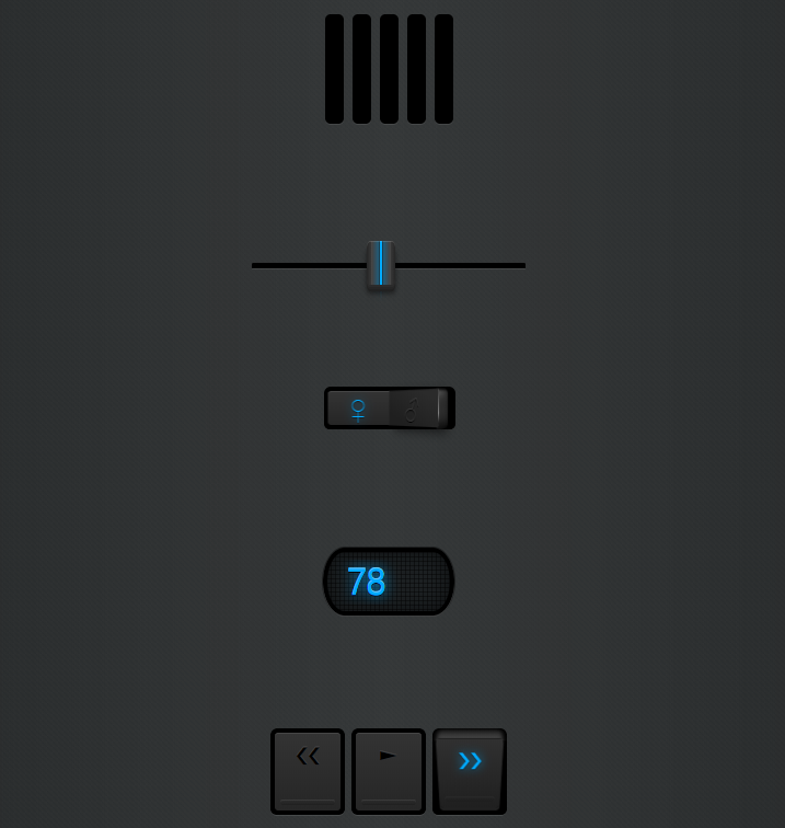
部分效果截图:
HTML代码(index.html):
<!doctype html>
<html>
<!-- author: @simurai -->
<head>
<title>css3 UI开关按钮</title>
<meta charset="utf-8">
<style>
/* This is just the basic styling for the whole page. */
/* Global ------------------------------------------------------ */
html {
font: 62.5%/1 "Lucida Sans Unicode","Lucida Grande",Verdana,Arial,Helvetica,sans-serif;
background-color: hsl(200,5%,15%);
background-size: 5px 5px;
background-image: -webkit-linear-gradient( 45deg, hsla(0,0%,0%,0) 0px,
hsla(0,0%,0%,.10) 50%,
hsla(0,0%,0%,0) 100% );
}
body {
margin: 0;
}
/* list ------------------------------------------------------ */
ul {
list-style: none;
padding: 50px 0;
margin: 0;
font-size: 2em;
text-align: center;
background-image: -webkit-linear-gradient( 0deg, hsla(0,0%,100%,0) 0px,
hsla(0,0%,100%,.09) 50%,
hsla(0,0%,100%,0) 100% );
}
ul li {
padding: 50px 0;
}
/* Aside ------------------------------------------------------ */
aside {
position: fixed;
top: 20px;
left: 20px;
}
aside button {
margin: 0;
padding: 10px ;
border: none;
border-radius: 5px;
font-weight: bold;
color: hsl(200,100%,60%);
background: hsla(0,0%,0%,.12);
cursor: pointer;
}
aside button:hover {
background: hsla(0,0%,0%,.2);
}
aside button:active {
-webkit-transform: translateY(1px);
}
/*
* umbrUI meter input by @simurai
*/
/* -------------- meter -------------- */
meter:nth-child(1) { -webkit-transform: translate(-50px, 50px) rotate(-90deg); }
meter:nth-child(2) { -webkit-transform: translate( -25px, 25px) rotate(-90deg); }
meter:nth-child(3) { -webkit-transform: translate( 0px, 0px) rotate(-90deg); }
meter:nth-child(4) { -webkit-transform: translate( 25px, -25px) rotate(-90deg); }
meter:nth-child(5) { -webkit-transform: translate( 50px, -50px) rotate(-90deg); }
meter {
-webkit-appearance: none;
position: relative;
display: block;
margin: 8px auto;
width: 100px;
height: 17px;
border-radius: 5px;
padding: 4px 5px 4px 5px;
box-sizing: border-box;
background: #000;
-webkit-box-shadow: -1px 0 0 hsla(0,0%,100%,.08);
-webkit-transform-origin: center 8px;
}
meter::-webkit-meter-bar {
background-color: hsl(200,10%,14%);
background-size: 2px 5px;
background-image: -webkit-linear-gradient( 0deg, hsla(0,0%,0%,.4) 1px, hsla(0,0%,0%,0) 1px ),
-webkit-linear-gradient( 90deg, hsla(0,0%,0%,1) 1px, hsla(0,0%,0%,0) 1px );
}
meter::-webkit-meter-optimum-value,
meter::-webkit-meter-suboptimum-value,
meter::-webkit-meter-even-less-good-value {
background-size: inherit;
background-image: inherit;
-webkit-box-shadow: 0 0 10px 2px hsla(200,100%,50%,.4);
-webkit-transition: width 1s cubic-bezier(.20, .10, .20, 1);
}
/* With these pseudo selectors you could change the colors when changing the value. */
meter::-webkit-meter-optimum-value { background-color: hsl(200,100%,50%); }
meter::-webkit-meter-suboptimum-value { background-color: hsl(200,100%,50%); }
meter::-webkit-meter-even-less-good-value { background-color: hsl(200,100%,50%); }
meter:hover::-webkit-meter-optimum-value,
meter:hover::-webkit-meter-suboptimum-value,
meter:hover::-webkit-meter-even-less-good-value {
/*In the real world, just change the element's value, this is just a hack for this demo.*/
width: 100% !important;
-webkit-transition: width .3s cubic-bezier(.20, .10, .20, 1);
}
/*
* umbrUI range slider by @simurai
*/
/* -------------- Range Slider -------------- */
input[type="range"] {
-webkit-appearance: none; /* Remove Safari default */
outline: none;
width: 250px;
height: 5px;
border-radius: 1px;
position: relative;
background-color: #000;
-webkit-background-clip: padding-box;
border: 0;
border-bottom: 1px solid rgba(255,255,255,0.1);
cursor: ew-resize;
}
input[type="range"]::-webkit-slider-thumb {
-webkit-appearance: none; /* Remove Safari default */
position: relative;
z-index: 1;
width: 26px;
height: 40px;
border-radius: 3px / 6px ;
background-image: -webkit-gradient( linear, left top, right top,
color-stop( 0, hsl(0,0%,15%) ),
color-stop( .16, hsl(0,0%,22%) ),
color-stop( .18, hsl(0,0%,30%) ),
color-stop( .2, hsl(0,0%,26%) ),
color-stop( .42, hsl(200,60%,30%) ),
color-stop( .44, hsl(200,0%,15%) ),
color-stop( .46, hsl(200,100%,50%) ),
color-stop( .54, hsl(200,100%,50%) ),
color-stop( .56, hsl(200,0%,15%) ),
color-stop( .58, hsl(200,60%,30%) ),
color-stop( .8, hsl(0,0%,26%) ),
color-stop( .82, hsl(0,0%,30%) ),
color-stop( .84, hsl(0,0%,22%) ),
color-stop( 1, hsl(0,0%,15%) )
);
-webkit-box-shadow:
inset hsla(0,0%,100%,.15) 0 1px 0px,
hsl(0,0%,17%) 0 2px 0px,
hsl(0,0%,15%) 0 4px 0px,
hsl(0,0%,13%) 0 6px 0px,
rgba(0,0,0,.5) 0 8px 5px;
-webkit-transform: translateY(-3px);
-webkit-box-reflect: below 0px -webkit-gradient(linear, left top, left bottom,
from(transparent), color-stop(0.6, transparent), to( rgba(255,255,255,0.15) ));
}
input[type="range"]:hover {
background-image: -webkit-gradient( linear, left top, right top,
color-stop( 0, hsl(200,80%,45%) ),
color-stop( .08, hsl(200,80%,15%) ),
color-stop( .5, hsl(200,80%,0%) ),
color-stop( .92, hsl(200,80%,15%) ),
color-stop( 1, hsl(200,80%,45%) )
);
-webkit-box-shadow: inset #000 1px 1px 1px, inset #000 -1px -1px 1px;
}
/*
* umbrUI checkboxes by @simurai
* Usage: <input type="checkbox" data-icon1="P" data-icon2="v" />
*/
/* ----------- Checkbox */
input[type="checkbox"] {
-webkit-appearance:none; /* Remove Safari default */
outline: none;
width: 120px;
height: 40px;
position: relative;
border-radius: 6px;
background-color: #000;
-webkit-background-clip: padding-box;
border: 0;
border-bottom: 1px solid transparent;
-webkit-perspective: 200;
}
input[type="checkbox"]:before, input[type="checkbox"]:after {
font: bold 22px/32px sans-serif;
text-align: center;
position: absolute;
z-index: 1;
width: 56px;
height: 30px;
top: 4px;
border: 0;
border-top: 1px solid rgba(255,255,255,0.15);
}
input[type="checkbox"]:before {
content: attr(data-icon1);
left: 4px;
border-radius: 3px 0 0 3px;
}
input[type="checkbox"]:after {
content: attr(data-icon2);
right: 4px;
border-radius: 0 3px 3px 0;
}
/* ----------- checked/unchecked */
/* unchecked */
input[type="checkbox"] {
-webkit-border-image: -webkit-gradient(linear, 100% 0%, 0% 0%,
from(rgba(255,255,255,0)), to(rgba(255,255,255,0)),
color-stop(.1,rgba(255,255,255,.05)),
color-stop(.3,rgba(5,137,200,0.4)),
color-stop(.45,rgba(255,255,255,.05)),
color-stop(.9,rgba(255,255,255,.1))
)100% 100%;
background-image: -webkit-gradient(
linear, right top, left top,
color-stop( 0, hsl(0,0%,0%) ),
color-stop( 0.14, hsl(0,0%,50%) ),
color-stop( 0.15, hsl(0,0%,0%) )
);
-webkit-box-shadow: inset #000 -7px 0 1px, inset #000 0 -5px 10px, inset #000 0 3px 3px;
}
input[type="checkbox"]:after {
background-image: -webkit-gradient(linear, 70% top, 40% bottom,
from( hsl(0,0%,17%) ),to( hsl(0,0%,12%) )
);
border-right: 1px solid transparent;
-webkit-border-image: -webkit-gradient(linear, left bottom, left top,
from(rgba(255,255,255,0)),
color-stop(.2,rgba(255,255,255,0)),
color-stop(.4,rgba(255,255,255,.5)),
to(rgba(255,255,255,.05))
)10% 100%;
-webkit-box-shadow: rgba(0,0,0,.6) 8px 3px 10px;
-webkit-transform: rotateY(-30deg) scaleX(.9) scaleY(1.1) translateX(-8px);
}
/* checked */
input[type="checkbox"]:checked {
-webkit-border-image: -webkit-gradient(linear, 0% 0%, 100% 0%,
from(rgba(255,255,255,0)), to(rgba(255,255,255,0)),
color-stop(.1,rgba(255,255,255,.05)),
color-stop(.3,rgba(5,137,200,0.4)),
color-stop(.45,rgba(255,255,255,.05)),
color-stop(.9,rgba(255,255,255,.1))
)100% 100%;
background-image: -webkit-gradient(
linear, left top, right top,
color-stop( 0, hsl(0,0%,0%) ),
color-stop( 0.14, hsl(0,0%,50%) ),
color-stop( 0.15, hsl(0,0%,0%) )
);
-webkit-box-shadow: inset #000 7px 0 1px, inset #000 0 -5px 10px, inset #000 0 3px 3px;
}
input[type="checkbox"]:checked:before {
background-image: -webkit-gradient( linear, 30% top, 60% bottom,
from( hsl(0,0%,17%) ),to( hsl(0,0%,12%) )
);
border-left: 1px solid transparent;
-webkit-border-image: -webkit-gradient(linear, left bottom, left top,
from(rgba(255,255,255,0)),
color-stop(.2,rgba(255,255,255,0)),
color-stop(.4,rgba(255,255,255,.5)),
to(rgba(255,255,255,.05))
)10% 100%;
-webkit-box-shadow: rgba(0,0,0,.6) -8px 3px 10px;
-webkit-transform: rotateY(30deg) scaleX(.9) scaleY(1.1) translateX(8px);
}
/* ----------- active/inactve */
/* Active */
input[type="checkbox"]:before, input[type="checkbox"]:checked:after {
color: hsl(200,100%,50%);
text-shadow: rgba(0,0,0,.5) 0 1px 1px, #0589c8 0 0 10px;
-webkit-transform: none;
background-image: -webkit-gradient( linear, left top, left bottom,
from( hsl(0,0%,20%) ), to( hsl(0,0%,15%) )
);
-webkit-border-image: none;
-webkit-box-shadow: none;
z-index: 2;
}
/* Inactive */
input[type="checkbox"]:after, input[type="checkbox"]:checked:before {
color: #000;
text-shadow: rgba(255,255,255,.1) 0 -1px 0;
-webkit-box-reflect: none;
z-index: 1;
}
/* ----------- hover */
input[type="checkbox"]:hover {
cursor: pointer;
}
input[type="checkbox"]:hover:before {
background-image: -webkit-gradient( linear, left top, left bottom,
from( hsl(0,0%,19%) ), to( hsl(0,0%,15%) )
);
}
input[type="checkbox"]:hover:after {
background-image: -webkit-gradient(linear, 70% top, 40% bottom,
from( hsl(0,0%,16%) ),to( hsl(0,0%,11%) )
);
}
input[type="checkbox"]:checked:hover:before {
background-image: -webkit-gradient( linear, 30% top, 60% bottom,
from( hsl(0,0%,16%) ),to( hsl(0,0%,12%) )
);
}
input[type="checkbox"]:checked:hover:after {
background-image: -webkit-gradient( linear, left top, left bottom,
from( hsl(0,0%,19%) ), to( hsl(0,0%,15%) )
);
}
/*
* umbrUI number input by @simurai
*/
@import url(http://fonts.googleapis.com/css?family=VT323);
/* -------------- number -------------- */
input[type="number"] {
-webkit-appearance: none;
outline: none;
position: relative;
z-index: 1;
width: 120px;
height: 60px;
border-radius: 40px / 60px;
font-family: 'VT323', cursive;
font-size: 36px;
line-height: 40px;
text-align: center;
-webkit-font-smoothing: none;
color: hsl(200,100%,50%);
text-shadow: 0 -1px 0px hsla(200,100%,70%,1), 0 1px 0px hsla(0,0%,0%,.8), 0 0 13px hsl(200,100%,50%);
border: 0;
background-color: hsl(200,10%,12%);
background-size: 4px 4px;
background-image: -webkit-linear-gradient( 0deg, hsla(0,0%,0%,0) 75%, hsla(0,0%,0%,.4) 75% ),
-webkit-linear-gradient( 90deg, hsla(0,0%,0%,0) 75%, hsla(0,0%,0%,.4) 75% );
-webkit-box-shadow: inset 0 0 0 4px hsla(0,0%,0%,1),
inset 0 0 20px 5px hsla(0,0%,0%,.5),
0 0px 0px 1px hsla(0,0%,0%,.4),
0 1px 0 hsla(0,0%,100%,.25);
}
/* Outer spin only works in Safari, so lets hide it */
input[type="number"]::-webkit-outer-spin-button { -webkit-appearance: none; margin: 0; }
/* Spin button */
input[type="number"]::-webkit-inner-spin-button {
-webkit-appearance: none;
width: 32px;
border-radius: 40px / 60px;
border: 4px solid #000;
cursor: ns-resize;
-webkit-box-shadow: inset 0px 0px 3px 1px hsla(0,0%,0%,.6),
inset 0px 6px 1px -2px hsla(0,0%,100%,.30),
inset 0px -7px 1px -1px hsla(0,0%,0%,.5);
background-color: hsl(0,0%,20%);
background-image:
-webkit-radial-gradient( 50% 5%, contain, hsla(0,0%,100%,.2) 0%, hsla(0,0%,0%,0) 70% ),
-webkit-radial-gradient( 50% 86%, contain, hsla(0,0%,100%,.05) 0%, hsla(0,0%,0%,0) 80% ),
-webkit-linear-gradient( -90deg, hsl(0,0%,15%) 0%,
hsl(0,0%,18%) 48%,
hsl(0,0%,10%) 48%,
hsl(0,0%,27%) 52%,
hsl(0,0%,20%) 52%,
hsl(0,0%,34%) 100% );
-webkit-transition: border-color .2s ease-in-out;
}
/* :active */
input[type="number"]:active::-webkit-inner-spin-button {
border-color: hsla(200,100%,50%,1);
-webkit-box-shadow: inset 0px 0px 3px 1px hsla(200,100%,20%,.6),
inset 0px 6px 1px -2px hsla(200,100%,70%,.4),
inset 0px -7px 1px -1px hsla(200,100%,10%,.5),
0px 0px 4px 3px hsla(200,100%,50%,.3);
-webkit-transition: none;
}
/*
* umbrUI radio buttons by @simurai
*/
/* ----------- radio */
input[type="radio"] {
-webkit-appearance:none; /* Remove Safari default */
outline: none;
width: 68px;
height: 80px;
position: relative;
display: inline-block;
margin: 3px;
border-radius: 6px;
background-color: #000;
-webkit-background-clip: padding-box;
border: 0;
border-bottom: 1px solid rgba(255,255,255,0.1);
-webkit-perspective: 200;
}
input[type="radio"]:before {
content: attr(data-icon);
font: 22px/22px sans-serif;
text-shadow: rgba(255,255,255,0.08) 0 -1px 0;
line-height: 40px;
text-align: center;
position: absolute;
z-index: 10;
width: 60px;
height: 70px;
margin: 4px;
border-radius: 3px;
background-image: -webkit-gradient( linear, left top, left bottom,
from( hsl(0,0%,20%) ), to( hsl(0,0%,15%) )
);
border-top: 1px solid rgba(255,255,255,0.15);
}
input[type="radio"]:after {
content: "";
z-index: 12;
position: absolute;
margin: 3px;
border-radius: 3px;
left: 6px;
top: 62px;
width: 50px;
height: 5px;
-webkit-box-shadow: inset rgba(0,0,0,.2) 0 -1px 2px, inset rgba(255,255,255,.1) 0 1px 1px;
}
/* ----------- checked */
input[type="radio"]:active, input[type="radio"]:checked {
-webkit-box-shadow: inset #000 4px 0px 4px, inset #000 -4px 0px 4px;
background-image: -webkit-gradient(
linear, left top, left bottom,
color-stop( 0, hsl(0,0%,10%) ),
color-stop( 0.14, hsl(0,0%,30%) ),
color-stop( 0.15, hsl(0,0%,0%) )
);
}
input[type="radio"]:active:before, input[type="radio"]:checked:before {
background-image: -webkit-gradient( linear, left top, left bottom,
from( hsl(0,0%,19%) ), to( hsl(0,0%,12%) )
);
z-index: 11;
border: 0;
border-top: 1px solid transparent;
-webkit-border-image: -webkit-gradient(linear, 0% 0%, 100% 0%,
color-stop(0, hsla(200,100%,85%,.05)),
color-stop(.5, hsl(200,0%,40%)),
color-stop(1, hsla(200,100%,80%,.05))
)50% 100%;
-webkit-box-shadow: 0px 2px 1px 1px hsl(0,0%,13%);
-webkit-transform: rotateX(-25deg) scaleX(.95) translateY(4px);
}
input[type="radio"]:checked:before {
color: hsl(200,100%,50%);
text-shadow: rgba(0,0,0,.5) 0 1px 1px, #0589c8 0 0 10px;
-webkit-border-image: -webkit-gradient(linear, 0% 0%, 100% 0%,
color-stop(0, hsla(200,100%,85%,.05)),
color-stop(.5, hsl(200,20%,50%)),
color-stop(1, hsla(200,100%,80%,.05))
)50% 100%;
}
input[type="radio"]:active:after, input[type="radio"]:checked:after {
top: 59px;
-webkit-transform: scale(.9);
opacity: .4;
}
/* ----------- hover */
input[type="radio"]:hover {
cursor: pointer;
}
input[type="radio"]:checked {
cursor: default;
}
input[type="radio"]:hover:before {
background-image: -webkit-gradient( linear, left top, left bottom,
from( hsl(0,0%,19.5%) ), to( hsl(0,0%,14%) )
);
}
input[type="radio"]:checked:hover:before {
background-image: -webkit-gradient( linear, left top, left bottom,
from( hsl(0,0%,19%) ), to( hsl(0,0%,12%) )
);
}
/*
* umbrUI progress input by @simurai
*/
/* -------------- progress -------------- */
progress {
-webkit-appearance: none;
position: relative;
width: 150px;
height: 17px;
border-radius: 5px;
padding: 4px;
background: #000;
-webkit-box-shadow: 0 1px 0 hsla(0,0%,100%,.1);
/*Disabled for now.
-webkit-box-reflect: below -3px -webkit-radial-gradient( 50% 70%, 50% 25%, hsla(0,0%,0%,.2) 0%, hsla(0,0%,0%,0) 95% );*/
}
progress::-webkit-progress-bar {
background-color: hsl(200,10%,14%);
background-size: 2px 5px;
background-image: -webkit-linear-gradient( 0deg, hsla(0,0%,0%,.4) 1px, hsla(0,0%,0%,0) 1px ),
-webkit-linear-gradient( 90deg, hsla(0,0%,0%,1) 1px, hsla(0,0%,0%,0) 1px );
}
progress::-webkit-progress-value {
background-size: inherit;
background-image: inherit;
background-color: hsl(200,100%,50%);
-webkit-box-shadow: 0 0 10px 2px hsla(200,100%,50%,.4);
-webkit-transition: width 1s cubic-bezier(.20, .10, .20, 1);
}
progress:hover::-webkit-progress-value {
/*In the real world, just change the element's value, this is just a hack for this demo.*/
width: 100% !important;
-webkit-transition: width .3s cubic-bezier(.20, .10, .20, 1);
}
</style>
<script>
var rel = "stylesheet";
function toggleUmbrUI(){
if(rel == "stylesheet") {
rel = ""
} else {
rel = "stylesheet"
}
var allsuspects = document.getElementsByClassName('umbrui');
for (var i=allsuspects.length; i>0; i--){
//console.log(allsuspects[i]);
console.log(allsuspects[i-1].href);
allsuspects[i-1].rel = rel;
}
}
//toggleUmbrUI();
</script>
</head>
<body>
<ul>
<!-- meter -->
<li>
<meter value="0.3"></meter>
<meter value="0.2"></meter>
<meter value="0.16"></meter>
<meter value="0.2"></meter>
<meter value="0.3"></meter>
</li>
<!-- range -->
<li>
<input type="range" />
</li>
<!-- checkbox -->
<li>
<input type="checkbox" data-icon1="♀" data-icon2="♂" />
</li>
<!-- number -->
<li>
<input type="number" min="1" max="99" value="78" />
</li>
<!-- radio -->
<li>
<input type="radio" name="radio" data-icon="❮❮" /><input type="radio" name="radio" data-icon="►" /><input type="radio" name="radio" data-icon="❯❯" />
</li>
<!-- progress -->
<li>
<progress value="0.3"></progress>
</li>
</ul>
</body>
</html>


 分享到QQ
分享到QQ 分享到微博
分享到微博 微信扫一扫
微信扫一扫