以下是 纯CSS3鼠标滑过动画按钮特效代码 的示例演示效果:
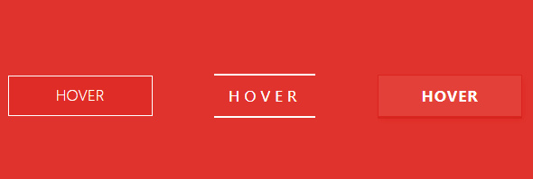
部分效果截图:
HTML代码(index.html):
<!doctype html>
<html lang="zh">
<head>
<meta charset="UTF-8">
<meta http-equiv="X-UA-Compatible" content="IE=edge,chrome=1">
<meta name="viewport" content="width=device-width, initial-scale=1.0">
<title>纯CSS3鼠标滑过动画按钮特效</title>
<link rel='stylesheet prefetch' href='css/reset.css'>
<link rel="stylesheet" type="text/css" href="css/default.css">

<!--必要样式-->
<link rel="stylesheet" type="text/css" href="css/styles.css">
<!--[if IE]>
	<script src="http://libs.useso.com/js/html5shiv/3.7/html5shiv.min.js"></script>
<![endif]-->
</head>
<body>

<section class="buttons">

	<div class="container">
		<h1>Button Hover Effects</h1>

		<a href="#" class="btn btn-1">
			<svg>
				<rect x="0" y="0" fill="none" width="100%" height="100%" />
			</svg>
			Hover
		</a>
		<!--End of Button 1 -->

		<a href="#" class="btn btn-2">Hover</a>
		<!--End of Button 2 -->

		<a href="#" class="btn btn-3">Hover</a>
		<!--End of Button 3 -->

		<a href="#" class="btn btn-4"><span>Hover</span></a>
		<!--End of Button 4 -->

		<a href="#" class="btn btn-5">Hover</a>
		<!--End of Button 5 -->
	</div>
</section>
</body>
</html>
CSS代码(styles.css):
@import url(http://fonts.useso.com/css?family=Roboto:400,100,900);*{box-sizing:inherit;-webkit-transition-property:all;transition-property:all;-webkit-transition-duration:.6s;transition-duration:.6s;-webkit-transition-timing-function:ease;transition-timing-function:ease;}
html,body{box-sizing:border-box;height:100%;width:100%;}
body{background:#E1332D;font-family:'Roboto',sans-serif;font-weight:400;}
.buttons{display:table;height:100%;width:100%;}
.container{display:table-cell;padding:1em;text-align:center;vertical-align:middle;}
h1{color:#fff;font-size:1.25em;font-weight:900;margin:0 0 2em;}
@media (min-width:450px){h1{font-size:1.75em;}
}
@media (min-width:760px){h1{font-size:3.25em;}
}
@media (min-width:900px){h1{font-size:5.25em;margin:0 0 1em;}
}
.btn{color:#fff;cursor:pointer;display:block;font-size:16px;font-weight:400;line-height:45px;margin:0 auto 2em;max-width:160px;position:relative;text-decoration:none;text-transform:uppercase;vertical-align:middle;width:100%;}
@media (min-width:400px){.btn{display:inline-block;margin-right:2.5em;}
.btn:nth-of-type(even){margin-right:0;}
}
@media (min-width:600px){.btn:nth-of-type(even){margin-right:2.5em;}
.btn:nth-of-type(5){margin-right:0;}
}
.btn:hover{text-decoration:none;}
.btn-1{background:#e02c26;font-weight:100;}
.btn-1 svg{height:45px;left:0;position:absolute;top:0;width:100%;}
.btn-1 rect{fill:none;stroke:#fff;stroke-width:2;stroke-dasharray:422,0;}
.btn-1:hover{background:rgba(225,51,45,0);font-weight:900;letter-spacing:1px;}
.btn-1:hover rect{stroke-width:5;stroke-dasharray:15,310;stroke-dashoffset:48;-webkit-transition:all 1.35s cubic-bezier(0.19,1,0.22,1);transition:all 1.35s cubic-bezier(0.19,1,0.22,1);}
.btn-2{letter-spacing:0;}
.btn-2:hover,.btn-2:active{letter-spacing:5px;}
.btn-2:after,.btn-2:before{-webkit-backface-visibility:hidden;backface-visibility:hidden;border:1px solid rgba(255,255,255,0);bottom:0px;content:" ";display:block;margin:0 auto;position:relative;-webkit-transition:all 280ms ease-in-out;transition:all 280ms ease-in-out;width:0;}
.btn-2:hover:after,.btn-2:hover:before{-webkit-backface-visibility:hidden;backface-visibility:hidden;border-color:#fff;-webkit-transition:width 350ms ease-in-out;transition:width 350ms ease-in-out;width:70%;}
.btn-2:hover:before{bottom:auto;top:0;width:70%;}
.btn-3{background:#e3403a;border:1px solid #da251f;box-shadow:0px 2px 0 #d6251f,2px 4px 6px #e02a24;font-weight:900;letter-spacing:1px;-webkit-transition:all 150ms linear;transition:all 150ms linear;}
.btn-3:hover{background:#e02c26;border:1px solid rgba(0,0,0,0.05);box-shadow:1px 1px 2px rgba(255,255,255,0.2);color:#ec817d;text-decoration:none;text-shadow:-1px -1px 0 #c2211c;-webkit-transition:all 250ms linear;transition:all 250ms linear;}
.btn-4{border:1px solid;overflow:hidden;position:relative;}
.btn-4 span{z-index:20;}
.btn-4:after{background:#fff;content:"";height:155px;left:-75px;opacity:.2;position:absolute;top:-50px;-webkit-transform:rotate(35deg);-ms-transform:rotate(35deg);transform:rotate(35deg);-webkit-transition:all 550ms cubic-bezier(0.19,1,0.22,1);transition:all 550ms cubic-bezier(0.19,1,0.22,1);width:50px;z-index:-10;}
.btn-4:hover:after{left:120%;-webkit-transition:all 550ms cubic-bezier(0.19,1,0.22,1);transition:all 550ms cubic-bezier(0.19,1,0.22,1);}
.btn-5{border:0 solid;box-shadow:inset 0 0 20px rgba(255,255,255,0);outline:1px solid;outline-color:rgba(255,255,255,0.5);outline-offset:0px;text-shadow:none;-webkit-transition:all 1250ms cubic-bezier(0.19,1,0.22,1);transition:all 1250ms cubic-bezier(0.19,1,0.22,1);}
.btn-5:hover{border:1px solid;box-shadow:inset 0 0 20px rgba(255,255,255,0.5),0 0 20px rgba(255,255,255,0.2);outline-color:rgba(255,255,255,0);outline-offset:15px;text-shadow:1px 1px 2px #427388;}


 分享到QQ
分享到QQ 分享到微博
分享到微博 微信扫一扫
微信扫一扫