以下是 css3鼠标悬停图标动画按钮切换代码 的示例演示效果:
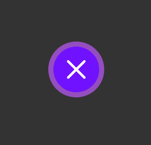
部分效果截图:
HTML代码(index.html):
<!DOCTYPE html>
<html class=''>
<head>
    <title>css3鼠标悬停图标动画按钮切换</title>
    <style class="cp-pen-styles">
        body {
            background-color: #333;
        }

        div {
            height: 200px;
            margin: 0 auto;
        }

        span {
            position: relative;
            width: 180px;
            height: 180px;
            display: block;
            margin: auto;
            top: 25px;
            border: 20px solid rgba(255, 255, 0, .25);
            background-color: rgba(124,155,13,1);
            -webkit-transition: .5s;
            -moz-transition: .5s;
            -ms-transition: .5s;
            transition: .5s;
            border-radius: 30px 0px 30px 0px;
        }

        span:before, span:after {
            position: absolute;
            display: block;
            background-color: #fff;
            border-radius: 10px;
            margin: auto;
            top: 0px;
            bottom: 0px;
            left: 0px;
            right: 0px;
        }

        span:before {
            width: 100px;
            height: 10px;
            content: "";
        }

        span:after {
            width: 10px;
            height: 100px;
            content: "";
        }

        div:hover span {
            -webkit-transform: scale(.5) rotate(45deg);
            -moz-transform: scale(.5) rotate(45deg);
            -ms-transform: scale(.5) rotate(45deg);
            transform: scale(.5) rotate(45deg);
            border-radius: 110px;
            background-color: rgba(112,18,255,1);
        }
    </style>
</head>
<body>
    <br />
    <br />
    <br />
    <br />
    <br />
    <div>
     <span></span>
    </div>
    <br />
    <br />
    <br />
    <br />
    <br />
    <br />
</body>
</html>


 分享到QQ
分享到QQ 分享到微博
分享到微博 微信扫一扫
微信扫一扫