以下是 jQuery+CSS3大眼睛萌蛋动画特效代码 的示例演示效果:
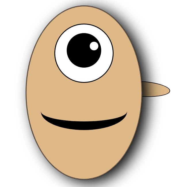
部分效果截图:
HTML代码(index.html):
<!DOCTYPE html>
<html>
<head>
<meta charset="UTF-8">
<title>jQuery+CSS3大眼睛萌蛋动画特效</title>
<style type="text/css">
	*{padding: 0;margin: 0;}
	#nav{
		width: 400px;
		height: 600px;
		border-radius: 50%;
		border-style: double;
		margin: 0 auto;
		background-color: burlywood;
		box-shadow: 20px 10px 50px black;
		position: relative;
	}
	#nav1{
		width: 200px;
		height: 200px;
		border-radius: 50%;
		border-style: solid;
		border-color: black;
		margin: 0 auto;
		margin-top: 60px;
		background-color: white;

		transition-property: all;
		-webkit-transition-property: all;
		-moz-transition-property: all;

		transition-duration: 2s;
		-webkit-transition-duration: 2s;
		-moz-transition-duration: 2s;
	}
	#nav1:hover{
		height: 150px;
	}
	#nav2{
		width: 120px;
		height: 120px;
		margin: 0 auto;
		margin-top: 30px;
		border-radius: 50%;
		background-color: black;

		transition-property: all;
		-webkit-transition-property: all;
		-moz-transition-property: all;

		transition-duration: 3s;
		-webkit-transition-duration: 3s;
		-moz-transition-duration: 3s;

		position: relative;
	}
	#nav2:hover{
		margin-top: 10px;
	}
	#nav3{
		width: 30px;
		height: 30px;
		border-radius: 50%;
		background-color: white;
		margin-left: 80px;
		margin-top: 30px;
		position: absolute;
	}
	#bottom{
	width: 50px;
	height:50px;
	border-width: 50px;
	border-radius: 50% 20px;
	border-style:ridge;
	border-color: red;
	text-overflow:ellipsis;
	position: absolute;
	display: none;
	margin-left: 30px;

	transform: rotate(220deg);
	-webkit-transform: rotate(220deg);
	-moz-transform: rotate(220deg);
	}
	#shou2{
	width: 200px;
	height:50px;
	border-width: 2px;
	border-radius: 50%;
	border-style:solid;
	position: absolute;
	border-left: none;
	background-color: burlywood;
	top: 260px;
	right: -150px;
	}
	#shou{
	width: 200px;
	height:50px;
	border-width: 2px;
	border-radius: 50%;
	border-style:solid;
	position: absolute;
	z-index: -10;
	border-left: none;
	background-color: burlywood;
	top: 260px;
	right: -100px;
	transform: rotate(30deg);/*30~-30*/
	-webkit-transform: rotate(30deg);/*30~-30*/
	-moz-transform: rotate(30deg);/*30~-30*/
	}
	#zui{
		position: absolute;
		top: 300px;
		left: 110px;
		width: 180px;
		height: 100px;
		border-width: 5px;
		border-color: black;
		border-radius: 50%;
		border-style:solid;
		margin: 0 auto;
		/*background-color: red;*/
		border-left: none;
		border-top: none;
		border-right: none;

		transition-property: all;
		-webkit-transition-property: all;
		-moz-transition-property: all;

		transition-duration: 1s;
		-webkit-transition-duration: 1s;
		-moz-transition-duration: 1s;
	}
	#zui:hover{
		left: 50px;
		border-width: 30px;
		width: 300px;
	}
</style>

<script src="js/jquery-1.9.1.min.js" type="text/javascript" charset="utf-8"></script>

</head>
<body>
<br><br>
<div id="nav">
	<div id="nav1">
		<div id="nav2">
			<div id="nav3"></div>
		</div>
	</div>
	<div id="bottom"></div>
	<div id="zui"></div>
	<div id="shou"></div>
</div>

<script type="text/javascript">
$("#nav3").mouseover(function(){
	$("#bottom").css("display","block");
	$("#nav").css("box-shadow","20px 10px 50px red");
})
$("#nav").mouseout(function(){
	$("#bottom").css("display","none");
	$("#nav").css("box-shadow","20px 10px 50px black");
})
var a=30;
var b=1;
setInterval(function(){
	shou.style.transform="rotate("+a+"deg)";
	a+=b;
	if(a>=30){
		b=-1;
	}else if(a<=(-30)){
		b=1;
	}
},50)
</script>
</body>
</html>


 分享到QQ
分享到QQ 分享到微博
分享到微博 微信扫一扫
微信扫一扫