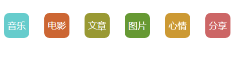
以下是 jQuery+CSS3文字背景按钮代码 的示例演示效果:
部分效果截图:
HTML代码(index.html):
<!DOCTYPE html PUBLIC "-//W3C//DTD XHTML 1.0 Transitional//EN" "http://www.w3.org/TR/xhtml1/DTD/xhtml1-transitional.dtd">
<html xmlns="http://www.w3.org/1999/xhtml">
<head>
    <title>CSS3按钮</title>
    <style type="text/css">
        .all {
            margin: 20px auto;
            width: 1010px;
            height: 70px;
        }

        .all .bll {
            width: 70px;
            height: 70px;
            float: left;
            margin-left: 10px;
        }

        .all .bll .list {
            width: 50px;
            height: 50px;
            -moz-border-radius: 10px;
            border-radius: 10px;
            cursor: pointer;
            margin: 0px auto;
            margin-top: 10px;
            line-height: 50px;
            text-align: center;
            color: White;
            font-weight: 500;
            font-size: 18px;
            font-family: @新宋体;
        }

        .divradius {
            -moz-border-radius: 50px;
            border-radius: 50px;
            line-height: 60px;
        }

        .all .bll .backc1:hover {
            -moz-border-radius: 50px;
            border-radius: 50px;
        }

        .all .bll .backc6:hover {
            -moz-border-radius: 50px;
            border-radius: 50px;
        }

        .all .bll .backc7:hover {
            -moz-box-shadow: 5px 5px 5px #888888;
            box-shadow: 5px 5px 5px #888888;
        }

        .all .bll .backc8 {
            transition: width 1s, height 1s;
            -moz-transition: width 1s, height 1s, -moz-transform 1s; /* Firefox 4 */
            -webkit-transition: width 1s, height 1s, -webkit-transform 1s; /* Safari and Chrome */
            -o-transition: width 1s, height 1s, -o-transform 1s; /* Opera */
        }

        .all .bll .backc8:hover {
            transform: rotateY(360deg);
            -moz-transform: rotateY(360deg); /* Firefox 4 */
            -webkit-transform: rotateY(360deg); /* Safari and Chrome */
            -o-transform: rotateY(360deg); /* Opera */
        }

        .all .bll .backc9 {
            transition: width 1s, height 1s;
            -moz-transition: width 1s, height 1s, -moz-transform 1s; /* Firefox 4 */
            -webkit-transition: width 1s, height 1s, -webkit-transform 1s; /* Safari and Chrome */
            -o-transition: width 1s, height 1s, -o-transform 1s; /* Opera */
        }

        .all .bll .backc9:hover {
            transform: rotateX(360deg);
            -moz-transform: rotateX(360deg); /* Firefox 4 */
            -webkit-transform: rotateX(360deg); /* Safari and Chrome */
            -o-transform: rotateX(360deg); /* Opera */
        }

        .all .bll .backc10 {
            transition: width 0.5s, height 0.5s;
            -moz-transition: width 0.5s, height 0.5s, -moz-transform 0.5s; /* Firefox 4 */
            -webkit-transition: width 0.5s, height 0.5s, -webkit-transform 0.5s; /* Safari and Chrome */
            -o-transition: width 0.5s, height 0.5s, -o-transform 0.5s; /* Opera */
        }

        .all .bll .backc10:hover {
            transform: rotate(45deg);
            -moz-transform: rotate(45deg); /* Firefox 4 */
            -webkit-transform: rotate(45deg); /* Safari and Chrome */
            -o-transform: rotate(45deg); /* Opera */
        }

        .all .bll .backc11 {
            transition: width 0.5s, height 0.5s;
            -moz-transition: width 0.5s, height 0.5s, -moz-transform 0.5s; /* Firefox 4 */
            -webkit-transition: width 0.5s, height 0.5s, -webkit-transform 0.5s; /* Safari and Chrome */
            -o-transition: width 0.5s, height 0.5s, -o-transform 0.5s; /* Opera */
        }

        .all .bll .backc11:hover {
            width: 60px;
            height: 60px;
            line-height: 60px;
            margin-top: 5px;
            transform: rotate(360deg);
            -moz-transform: rotate(360deg); /* Firefox 4 */
            -webkit-transform: rotate(360deg); /* Safari and Chrome */
            -o-transform: rotate(360deg); /* Opera */
        }

        .all .bll a {
            text-decoration: none;
        }

        .backc1 {
            background-color: #66cccc;
        }

        .backc2 {
            background-color: #cc6633;
        }

        .backc3 {
            background-color: #999933;
        }

        .backc4 {
            background-color: #669933;
        }

        .backc5 {
            background-color: #cc9933;
        }

        .backc6 {
            background-color: #cc6666;
        }

        .backc7 {
            background-color: #336666;
        }

        .backc8 {
            background-color: #cc6633;
        }

        .backc9 {
            background-color: #5B5B00;
        }

        .backc10 {
            background-color: #ff9966;
        }

        .backc11 {
            background-color: #669999;
        }
    </style>
    <script type="text/javascript" src="js/jquery-1.5.2.min.js"></script>
    <script type="text/javascript">
        $(function () {
            $(".backc2").mouseover(function () {
                $(this).animate({ marginTop: "5px" }, 200);
            });
            $(".backc2").mouseleave(function () {
                $(this).animate({ marginTop: "10px" }, 200);
            });

            $(".backc3").mouseover(function () {
                $(this).animate({ marginTop: "5px" }, 200);
                $(this).animate({ marginTop: "10px" }, 200);
            });

            $(".backc4").mouseover(function () {
                $(this).fadeTo(300, 0.3);
            });
            $(".backc4").mouseleave(function () {
                $(this).fadeTo(300, 1);
            });

            $(".backc5").mouseover(function () {
                $(this).fadeTo(400, 0.3);
                $(this).fadeTo(400, 1);
            });

            $(".backc6").mouseover(function () {
                $(this).addClass("divradius").fadeTo(300, 0.3);
            });
            $(".backc6").mouseleave(function () {
                $(this).removeClass("divradius").fadeTo(300, 1);
            });
        });
    </script>
</head>
<body>
    <div class="all">
        <div class="bll"><a href="#"><div class="list backc1">音乐</div></a></div>
        <div class="bll"><a href="#"><div class="list backc2">电影</div></a></div>
        <div class="bll"><a href="#"><div class="list backc3">文章</div></a></div>
        <div class="bll"><a href="#"><div class="list backc4">图片</div></a></div>
        <div class="bll"><a href="#"><div class="list backc5">心情</div></a></div>
        <div class="bll"><a href="#"><div class="list backc6">分享</div></a></div>
        <div class="bll"><a href="#"><div class="list backc7">晒晒</div></a></div>
        <div class="bll"><a href="#"><div class="list backc8">新闻</div></a></div>
        <div class="bll"><a href="#"><div class="list backc9">周刊</div></a></div>
        <div class="bll"><a href="#"><div class="list backc10">笑话</div></a></div>
        <div class="bll"><a href="#"><div class="list backc11">空间</div></a></div>
    </div>
</body>
</html>


 分享到QQ
分享到QQ 分享到微博
分享到微博 微信扫一扫
微信扫一扫