以下是 css3冬天雪花飘落动画特效css代码. 的示例演示效果:
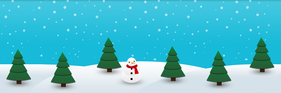
部分效果截图:
HTML代码(index.html):
<!DOCTYPE html PUBLIC "-//W3C//DTD XHTML 1.0 Transitional//EN" "http://www.w3.org/TR/xhtml1/DTD/xhtml1-transitional.dtd">
<html xmlns="http://www.w3.org/1999/xhtml">
<head>
<meta http-equiv="Content-Type" content="text/html; charset=gb2312" />
<title>css3冬天雪花飘落动画特效</title>
<style type="text/css">
body{margin:0;padding:0;list-style-type:none;}
.header{
	margin: 0 0 30px;
	background: url(css/img/header-bg.png);
	background: url(css/img/snow-bg.png) repeat-y center, url(css/img/header-bg.png);
	-webkit-animation: animate-snow 9s linear infinite;
	-moz-animation: animate-snow 9s linear infinite;
	-ms-animation: animate-snow 9s linear infinite;
	animation: animate-snow 9s linear infinite;
}

@-webkit-keyframes animate-snow
{
	0% { background-position: center 0, 0 0;}
	100% { background-position: center 885px, 0 0;}
}

@-moz-keyframes animate-snow
{
	0% { background-position: center 0, 0 0;}
	100% { background-position: center 885px, 0 0;}
}

@-ms-keyframes animate-snow
{
	0% { background-position: center 0, 0 0;}
	100% { background-position: center 885px, 0 0;}
}

@keyframes animate-snow
{
	0% { background-position: center 0, 0 0;}
	100% { background-position: center 885px, 0 0;}
}

.wrapper{ width: 960px; height: 315px; margin: auto; overflow: hidden; position: relative; background-image: url(css/img/wrapper-bg.png); background-repeat: no-repeat; background-position: bottom;    }

@-moz-keyframes animate-drop {

	0% {opacity:0;-moz-transform: translate(0, -315px);}
	100% {opacity:1;-moz-transform: translate(0, 0);}
}

@-webkit-keyframes animate-drop {

	0% {opacity:0;-webkit-transform: translate(0, -315px);}
	100% {opacity:1;-webkit-transform: translate(0, 0);}
}

@-ms-keyframes animate-drop {

	0% {opacity:0;-ms-transform: translate(0, -315px);}
	100% {opacity:1;-ms-transform: translate(0, 0);}
}

@keyframes animate-drop {

	0% {opacity:0;transform: translate(0, -315px);}
	100% {opacity:1;transform: translate(0, 0);}
}

.christmas-tree, .snowman {
	position: absolute;
	-moz-animation: animate-drop 1s linear;
	-webkit-animation: animate-drop 1s linear;
	-ms-animation: animate-drop 1s linear;
	animation: animate-drop 1s linear;
}

.christmas-tree {
	width: 112px;
	height: 137px;
	background: url(css/img/christmas-tree.png);
}

.snowman {
	width: 115px;
	height: 103px;
	top: 195px;
	left: 415px;
	background: url(css/img/snowman.png);
	-moz-animation-duration: .6s;
	-webkit-animation-duration: .6s;
	-ms-animation-duration: .6s;
	animation-duration: .6s;
}

.tree1 {
	top: 165px;
	left: 35px;
	-moz-animation-duration: .6s;
	-webkit-animation-duration: .6s;
	-ms-animation-duration: .6s;
	animation-duration: .6s;
}

.tree2 {
	left: 185px;
	top: 175px;
	-moz-animation-duration: .9s;
	-webkit-animation-duration: .9s;
	-ms-animation-duration: .9s;
	animation-duration: .9s;
}

.tree3 {
	left: 340px;
	top: 125px;
	-moz-animation-duration: .7s;
	-webkit-animation-duration: .7s;
	-ms-animation-duration: .7s;
	animation-duration: .7s;
}

.tree4 {
	left: 555px;
	top: 155px;
	-moz-animation-duration: .8s;
	-webkit-animation-duration: .8s;
	-ms-animation-duration: .8s;
	animation-duration: .8s;
}

.tree5 {
	left: 710px;
	top: 170px;
	-moz-animation-duration: .7s;
	-webkit-animation-duration: .7s;
	-ms-animation-duration: .7s;
	animation-duration: .7s;
}

.tree6 {
	left: 855px;
	top: 125px;
	-moz-animation-duration: .6s;
	-webkit-animation-duration: .6s;
	-ms-animation-duration: .6s;
	animation-duration: .6s;
}
</style>

</head>

<body>

<div class="header">
	<div class="wrapper">
		<div class="christmas-tree tree1"></div>
		<div class="christmas-tree tree2"></div>
		<div class="christmas-tree tree3"></div>
	  <div class="snowman"></div>
		<div class="christmas-tree tree4"></div>
		<div class="christmas-tree tree5"></div>
		<div class="christmas-tree tree6"></div>
	</div>
</div>
</body>
</html>


 分享到QQ
分享到QQ 分享到微博
分享到微博 微信扫一扫
微信扫一扫