以下是 js鼠标点击水波动画效果插件代码 的示例演示效果:
部分效果截图:
HTML代码(index.html):
<!DOCTYPE html>
<html>
<head>
<title>js鼠标点击水波动画效果插件</title>
<meta name="viewport" content="width=device-width, initial-scale=1, maximum-scale=1, user-scalable=0"/>
<style>
body,html {
background: #fafafa;
padding:0px 0px 50px 0px;
margin:0px;
font-family: 'Raleway' sans-serif;
-webkit-tap-highlight-color: rgba(0,0,0,0);
}
h1 {
background: #03a9f4;
padding: 2em 0px 2em 100px;
color: white;
margin:0px;
font-weight:200;
font-size:xx-large;
}
p, h2 {
color: #6c6c6c;
margin-left:100px;
max-width:500px;
font-weight:200;
}
h2 {
font-size:large;
color: #333;
}
.smallprint {
font-size:xx-small;
}
.smallprint a {
color: black;
text-decoration:none;
}
input:focus,
select:focus,
textarea:focus,
button:focus,
a:active {
-webkit-touch-callout: none;
-webkit-user-select: none;
-khtml-user-select: none;
-moz-user-select: none;
-ms-user-select: none;
user-select: none;
outline: none;
}
a {
color: #4285f4;
}
ul {
list-style: none;
max-width: 400px;
text-align:center;
box-shadow: 3px 3px 5px #ccc;
margin-left:100px;
padding:0px;
}
ul a {
background: white;
display: block;
padding: 1em;
text-decoration: none;
}
</style>
</head>
<body>
<h1>RippleButtons.js</h1>
<h2>Example 1: Square Button</h2>
<p>
<button class="ripple ripple-radial" style="background: #ffab91; border: none; width:100px;height:100px;color:#444;font-weight:bold;font-size:x-large;padding-top:50px">
Click
</button>
</p>
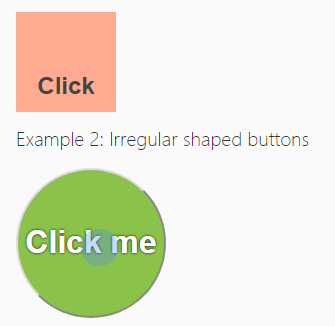
<h2>Example 2: Irregular shaped buttons</h2>
<p>
<button style="background: #8bc34a; text-shadow: 0px 0px 3px #000; width:150px;height:150px;border-radius:100% 100%;color:white;font-weight:bold;font-size:xx-large">
Click me
</button>
</p>
<h2>Example 3: Button List</h2>
<ul class="linklist">
<li><a href="" onclick="return false">Click Option 1</a></li>
<li><a href="" onclick="return false">Click Option 2</a></li>
<li><a href="" onclick="return false">Click Option 3</a></li>
<li><a href="" onclick="return false">Click Option 4</a></li>
</ul>
<script type="text/javascript" src="ripple.js"></script>>
</body>
</html>
JS代码(ripple.js):
(function(){
	"use strict";
	var colour = "#4285f4";
	var opacity = 0.3;
	var ripple_within_elements = ['input','button','a'];
	var ripple_without_diameter = 50;
	var overlays ={
	items:[],get:function(){
	var $element;
	for(var i = 0;
	i < overlays.items.length;
	i++){
	$element = overlays.items[i];
	if($element.transition_phase === false){
	$element.transition_phase = 0;
	return $element;
}
}
$element = document.createElement("div");
	$element.style.position = "absolute";
	$element.style.opacity = opacity;
	//$element.style.outline = "10px solid red";
	$element.style.pointerEvents = "none";
	$element.style.background = "-webkit-radial-gradient(" + colour + " 64%,rgba(0,0,0,0) 65%) no-repeat";
	$element.style.background = "radial-gradient(" + colour + " 64%,rgba(0,0,0,0) 65%) no-repeat";
	$element.style.transform = "translateZ(0)";
	$element.transition_phase = 0;
	$element.rid = overlays.items.length;
	$element.next_transition = overlays.next_transition_generator($element);
	document.body.appendChild($element);
	overlays.items.push($element);
	return $element;
}
,next_transition_generator:function($element){
	return function(){
	$element.transition_phase++;
	switch($element.transition_phase){
	case 1:$element.style[transition] = "all 0.2s ease-in-out";
	$element.style.backgroundSize = $element.ripple_backgroundSize;
	$element.style.backgroundPosition = $element.ripple_backgroundPosition;
	setTimeout($element.next_transition,0.2 * 1000);
	//now I know transitionend is better but it fires multiple times when multiple properties are animated,so this is simpler code and (imo) worth tiny delaysbreak;
	case 2:$element.style[transition] = "opacity 0.15s ease-in-out";
	$element.style.opacity = 0;
	setTimeout($element.next_transition,0.15 * 1000);
	break;
	case 3:overlays.recycle($element);
	break;
}
}
;
}
,recycle:function($element){
	$element.style.display = "none";
	$element.style[transition] = "none";
	if($element.timer) clearTimeout($element.timer);
	$element.transition_phase = false;
}
}
;
	var transition = function(){
	var i,el = document.createElement('div'),transitions ={
	'WebkitTransition':'webkitTransition','transition':'transition','OTransition':'otransition','MozTransition':'transition'}
;
	for (i in transitions){
	if (transitions.hasOwnProperty(i) && el.style[i] !== undefined){
	return transitions[i];
}
}
}
();
	var click = function(event){
	var $element = overlays.get(),touch,x,y;
	touch = event.touches ? event.touches[0]:event;
	$element.style[transition] = "none";
	$element.style.backgroundSize = "3px 3px";
	$element.style.opacity = opacity;
	if(ripple_within_elements.indexOf(touch.target.nodeName.toLowerCase()) > -1){
	x = touch.offsetX;
	y = touch.offsetY;
	var dimensions = touch.target.getBoundingClientRect();
	if(!x || !y){
	x = (touch.clientX || touch.x) - dimensions.left;
	y = (touch.clientY || touch.y) - dimensions.top;
}
$element.style.backgroundPosition = x + "px " + y + "px";
	$element.style.width = dimensions.width + "px";
	$element.style.height = dimensions.height + "px";
	$element.style.left = (dimensions.left) + "px";
	$element.style.top = (dimensions.top + document.body.scrollTop + document.documentElement.scrollTop) + "px";
	var computed_style = window.getComputedStyle(event.target);
	for (var key in computed_style){
	if (key.toString().indexOf("adius") > -1){
	if(computed_style[key]){
	$element.style[key] = computed_style[key];
}
}
else if(parseInt(key,10).toString() === key && computed_style[key].indexOf("adius") > -1){
	$element.style[computed_style[key]] = computed_style[computed_style[key]];
}
}
$element.style.backgroundPosition = x + "px " + y + "px";
	$element.ripple_backgroundPosition = (x - dimensions.width) + "px " + (y - dimensions.width) + "px";
	$element.ripple_backgroundSize = (dimensions.width * 2) + "px " + (dimensions.width * 2) + "px";
}
else{
	//click was outside of ripple elementx = touch.clientX || touch.x || touch.pageX;
	y = touch.clientY || touch.y || touch.pageY;
	$element.style.borderRadius = "0px";
	$element.style.left = (x - ripple_without_diameter / 2) + "px";
	$element.style.top = (document.body.scrollTop + document.documentElement.scrollTop + y - ripple_without_diameter / 2) + "px";
	$element.ripple_backgroundSize = ripple_without_diameter + "px " + ripple_without_diameter + "px";
	$element.style.width = ripple_without_diameter + "px";
	$element.style.height = ripple_without_diameter + "px";
	$element.style.backgroundPosition = "center center";
	$element.ripple_backgroundPosition = "center center";
	$element.ripple_backgroundSize = ripple_without_diameter + "px " + ripple_without_diameter + "px";
}
$element.ripple_x = x;
	$element.ripple_y = y;
	$element.style.display = "block";
	setTimeout($element.next_transition,20);
}
;
	if('ontouchstart' in window || 'onmsgesturechange' in window){
	document.addEventListener("touchstart",click,false);
}
else{
	document.addEventListener("click",click,false);
}
}
());


 分享到QQ
分享到QQ 分享到微博
分享到微博 微信扫一扫
微信扫一扫