以下是 jQuery+CSS3线性时钟插件特效代码 的示例演示效果:
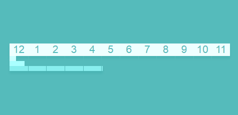
部分效果截图:
HTML代码(index.html):
<!DOCTYPE html>
<html>

<head>
  <meta charset="UTF-8">
  <title>jQuery+CSS3线性时钟插件 - 程序员设计师联盟淘宝店</title>
  <link rel='stylesheet prefetch' href='css/bootstrap.css'>
  <link rel="stylesheet" href="css/style.css" media="screen" type="text/css" />
</head>

<body>
  <div id='clock'>
    <div id="numbers"></div>
    <div id="seconds" class="time_bar"></div>
    <div id="minutes" class="time_bar"></div>
    <div id="hours" class="time_bar"></div>
</div>
  <script src='js/jquery.js'></script>
  <script src="js/index.js"></script>
</body>
</html>
JS代码(index.js):
$(document).ready(function(){
	// Set up clock's numbers for (var i = 0;
	i < 12;
	i++){
	if (i != 0){
	$("#numbers").append("<span id="+i+" class=\'number-box\'><div class=\'number\'>"+i+"</div><div class=\'line\'></div></span>");
}
else{
	$("#numbers").append("<span id="+12+" class=\'number-box\'><div class=\'number\'>"+12+"</div></span>");
}
}
// Display time bars var d,ms,s,m,h;
	var clock = $("#clock");
	var secondBar = $("#seconds");
	var SPM = 60;
	// Seconds Per Minute var seconds = setInterval(function(){
	d = new Date();
	ms = d.getMilliseconds();
	s = (d.getSeconds() + (ms / 1000));
	sWidth = (s / 60) * 100;
	//Percentage of seconds $("#seconds").width(sWidth+'%');
	// Set width of bar}
,200) var minutes = setInterval(function(){
	m = d.getMinutes();
	mWidth = ((m + (sWidth / 100)) / 60) * 100;
	//Percentage of seconds $("#minutes").width(mWidth+'%');
}
,500) var hours = setInterval(function(){
	h = d.getHours() % 12;
	hWidth = ((h + (mWidth / 100)) / 12) * 100;
	//Percentage of seconds $("#hours").width(hWidth+'%');
}
,1000)}
);
CSS代码(style.css):
html{font-family:"HelveticaNeue-Light","Helvetica Neue Light","Helvetica Neue",Helvetica,Arial,"Lucida Grande",sans-serif;}
body{background-color:#55bbbb;padding-top:100px;}
#clock{position:relative;width:auto;padding:10px;margin-left:auto;margin-right:auto;border-radius:10px;}
#numbers{box-shadow:0px 5px 5px 0px rgba(70,177,177,0.85);}
@media screen and (max-width:649px){#numbers{font-size:150%;font-weight:100;height:25px;}
#numbers .number{top:7.5%;}
}
@media screen and (min-width:650px){#numbers{font-size:300%;font-weight:100;height:50px;}
#numbers .number{top:30%;}
}
@media screen and (min-width:900px){#numbers{font-size:450%;font-weight:100;height:70px;}
#numbers .number{top:35%;}
}
.number-box{background:#eeffff;position:relative;display:inline-block;width:8.33333333%;height:100%;text-align:center;}
.number{position:relative;height:100%;color:#55bbbb;}
.line{position:absolute;width:1px;height:30px;background:#55bbbb;}
.time_bar{height:10px;background:white;width:0%;box-shadow:0px 5px 5px 0px rgba(70,177,177,0.85);}
#seconds{background:#ccffff;transition:width 0.2s linear;}
#minutes{background:#aaffff;transition:width 0.5s linear;}
#hours{background:#88eeee;transition:width 1s linear;}


 分享到QQ
分享到QQ 分享到微博
分享到微博 微信扫一扫
微信扫一扫