以下是 3D图片切片滑块旋转动画特效代码 的示例演示效果:
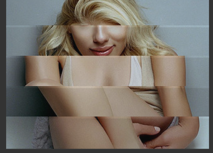
部分效果截图:
HTML代码(index.html):
<!DOCTYPE html>
<html>

<head>

  <meta charset="UTF-8">
  <title>3D图片切片滑块旋转动画</title>
    <style>
/**************************************************/
/* INSTRUCTIONS: DRAG OVER THE IMAGE TO TWIST IT */
/**************************************************/
body {
  perspective: 50em;
  background-color: #333333;
}

.cube {
  position: relative;
  margin: 0em auto 0;
  padding: 0px;
  width: 20em;
  height: 3.0em;
  list-style: none;
  transform-style: preserve-3d;
  /*animation: ani 8s infinite linear;*/
}

.face {
  box-sizing: border-box;
  position: absolute;
  top: 180px;
  left: 50%;
  /*border: 1px solid #f0f0f0;*/
  margin: -8em;
  padding: 1.6em;
  width: 20em;
  height: 2em;
  opacity: .85;
  background: lightblue;
  /*Creative Commons image from http://www.flickr.com/photos/37825670@N07/3562600154/sizes/z/in/photostream/ */
  background: url(k6dbiLv.jpg) -115px -900px;
  background-repeat: no-repeat;
  backface-visibility: hidden;
}

.face:nth-child(1) {
  transform: translateZ(10em);
}

.face:nth-child(2) {
  transform: rotateY(180deg) translateZ(10em);
}

.face:nth-child(3) {
  transform: rotateY(90deg) translateZ(10em);
}

.face:nth-child(4) {
  transform: rotateY(-90deg) translateZ(10em);
}

a {
  color: #ccc;
}

</style>

    <script src="js/prefixfree.min.js"></script>

</head>

<body>

<ul id="level0" class='cube'>
<li class='face'></li>
<li class='face'></li>
<li class='face'></li>
<li class='face'></li>
</ul>
<ul id="level1" class='cube'>
<li class='face'></li>
<li class='face'></li>
<li class='face'></li>
<li class='face'></li>
</ul>
<ul id="level2" class='cube'>
<li class='face'></li>
<li class='face'></li>
<li class='face'></li>
<li class='face'></li>
</ul>
<ul id="level3" class='cube'>
<li class='face'></li>
<li class='face'></li>
<li class='face'></li>
<li class='face'></li>
</ul>
<ul id="level4" class='cube'>
<li class='face'></li>
<li class='face'></li>
<li class='face'></li>
<li class='face'></li>
</ul>
<ul id="level5" class='cube'>
<li class='face'></li>
<li class='face'></li>
<li class='face'></li>
<li class='face'></li>
</ul>
<ul id="level6" class='cube'>
<li class='face'></li>
<li class='face'></li>
<li class='face'></li>
<li class='face'></li>
</ul>
<ul id="level7" class='cube'>
<li class='face'></li>
<li class='face'></li>
<li class='face'></li>
<li class='face'></li>
</ul>
<ul id="level8" class='cube'>
<li class='face'></li>
<li class='face'></li>
<li class='face'></li>
<li class='face'></li>
</ul>
<ul id="level9" class='cube'>
<li class='face'></li>
<li class='face'></li>
<li class='face'></li>
<li class='face'></li>
</ul>
<ul id="level10" class='cube'>
<li class='face'></li>
<li class='face'></li>
<li class='face'></li>
<li class='face'></li>
</ul>
<ul id="level11" class='cube'>
<li class='face'></li>
<li class='face'></li>
<li class='face'></li>
<li class='face'></li>
</ul>
<ul id="level12" class='cube'>
<li class='face'></li>
<li class='face'></li>
<li class='face'></li>
<li class='face'></li>
</ul>
  <script src='js/jquery.js'></script>
  <script src='js/TweenMax.min.js'></script>
  <script src="js/index.js"></script>
</body>
</html>
JS代码(index.js):
// work in progress - just playing around to try to get some interesting effects - drag over the image it should twist around in some sort of css3d space - should work in chrome and FF not sure about ie - seen similar ideas for displaying graphics many times but i think one of the best was an old flash one by yugop.com but I cannot find it online anymore and it has been done many times since./* * Copyright MIT © <2013> < dehash.com > * * Permission is hereby granted,free of charge,to any person obtaining a copy of this software and associated * documentation files (the "Software"),to deal in the Software without restriction,including without limitation * the rights to use,copy,modify,merge,publish,distribute,sublicense,and/or sell copies of the Software,and * to permit persons to whom the Software is furnished to do so,subject to the following conditions:* The above copyright notice and this permission notice shall be included in all copies or substantial portions of the Software. * THE SOFTWARE IS PROVIDED "AS IS",WITHOUT WARRANTY OF ANY KIND,EXPRESS OR IMPLIED,* INCLUDING BUT NOT LIMITED TO THE WARRANTIES OF MERCHANTABILITY,FITNESS FOR A PARTICULAR * PURPOSE AND NONINFRINGEMENT. IN NO EVENT SHALL THE AUTHORS OR COPYRIGHT HOLDERS BE LIABLE * FOR ANY CLAIM,DAMAGES OR OTHER LIABILITY,WHETHER IN AN ACTION OF CONTRACT,TORT OR OTHERWISE,* ARISING FROM,OUT OF OR IN CONNECTION WITH THE SOFTWARE OR THE USE OR OTHER DEALINGS IN THE SOFTWARE. */
// varsvar gap=0;
	var slow=7;
	var md = false;
	var oldMouseX=0;
	var mouseX=0;
	var mouseY=0;
	var numLevels=13;
	var gaps=[];
	var gapscnt=0;
	var currentLevel=0;
	var px=[0,0,0,0,0,0,0,0,0,0,0,0,0];
	var vx=[0,0,0,0,0,0,0,0,0,0,0,0,0];
	varwindowHalfX = window.innerWidth / 2;
	varwindowHalfY = window.innerHeight / 2;
	init()function tickHandler(){
	//run your logic here...if(md){
	gap=averageGaps(mouseX-oldMouseX);
}
gap*=.9;
	vx[currentLevel]+=gap;
	oldMouseX = mouseX;
	var i;
	for ( i = currentLevel;
	i < numLevels;
	i++){
	vx[i+1]+=((vx[i]-vx[i+1])/slow);
}
for ( i = currentLevel;
	i > 0;
	i--){
	vx[i-1]+=(vx[i]-vx[i-1])/slow;
}
for ( i = 0;
	i <numLevels;
	i++){
	px[i]+=(vx[i]-px[i]);
	// trying tweenmax duration 0 method of setting rotationYTweenMax.to($('#level'+i),0,{
	rotationY:px[i]}
);
}
}
// functionsfunction init(){
	// code for cubevar d=0.12;
	var p=3;
	for(var i=0;
	i<numLevels;
	i++){
	var posString="-115px "+(-48*i)+ "px";
	TweenMax.to($('#level'+i+' li'),1,{
	css:{
	backgroundPosition:posString}
,delay:(d*i)}
);
}
TweenLite.ticker.addEventListener("tick",tickHandler);
	$('.cube').mouseover(function(){
	TweenMax.to($('.face'),1,{
	opacity:1}
);
}
);
	$('.cube').mouseout(function(){
	TweenMax.to($('.face'),1,{
	opacity:.85}
);
}
);
	$(document).on('mousedown',function(event){
	event.preventDefault();
	oldMouseX = mouseX;
	gaps.length = 0;
	md=true;
}
).on('mouseup',function(event){
	md=false;
}
).on('mousemove',function(event){
	mouseX = event.clientX - windowHalfX;
	mouseY = event.clientY - windowHalfY;
}
);
	$('#level0').mousedown(function(){
	currentLevel=0;
}
);
	$('#level1').mousedown(function(){
	currentLevel=1;
}
);
	$('#level2').mousedown(function(){
	currentLevel=2;
}
);
	$('#level3').mousedown(function(){
	currentLevel=3;
}
);
	$('#level4').mousedown(function(){
	currentLevel=4;
}
);
	$('#level5').mousedown(function(){
	currentLevel=5;
}
);
	$('#level6').mousedown(function(){
	currentLevel=6;
}
);
	$('#level7').mousedown(function(){
	currentLevel=7;
}
);
	$('#level8').mousedown(function(){
	currentLevel=8;
}
);
	$('#level9').mousedown(function(){
	currentLevel=9;
}
);
	$('#level10').mousedown(function(){
	currentLevel=10;
}
);
	$('#level11').mousedown(function(){
	currentLevel=11;
}
);
	$('#level12').mousedown(function(){
	currentLevel=12;
}
);
	var touchEnabled = 'ontouchstart' in window || navigator.msMaxTouchPoints;
	if (touchEnabled == true){
	console.log("touchEnabled");
	document.addEventListener('touchmove',onTouchMove,false);
	document.addEventListener('touchstart',onTouchStart,false);
	document.addEventListener('touchend',onTouchEnd,false);
}
}
function onTouchMove(event){
	event.preventDefault();
	var touch = event.touches[0];
	mouseX = touch.pageX - windowHalfX;
	mouseY = touch.pageY - windowHalfY;
}
function onTouchStart(event){
	event.preventDefault();
	oldMouseX = mouseX;
	gaps.length = 0;
	md=true;
}
function onTouchEnd(event){
	event.preventDefault();
	md = false;
}
function averageGaps(n){
	if(isNaN(n)){
	return 0;
}
var gl=gaps.length;
	gaps[gapscnt]=n;
	var ave =0;
	for (var i = 0;
	i < gl;
	i++){
	ave+=gaps[i];
}
;
	gapscnt=(gapscnt+1)%10;
	var tmp=ave/gl;
	if(isNaN(tmp)){
	tmp=0;
}
return tmp;
}
CSS代码(normalize.css):
html{font-family:sans-serif;-ms-text-size-adjust:100%;-webkit-text-size-adjust:100%}
body{margin:0}
article,aside,details,figcaption,figure,footer,header,hgroup,main,nav,section,summary{display:block}
audio,canvas,progress,video{display:inline-block;vertical-align:baseline}
audio:not([controls]){display:none;height:0}
[hidden],template{display:none}
a{background:transparent}
a:active,a:hover{outline:0}
abbr[title]{border-bottom:1px dotted}
b,strong{font-weight:bold}
dfn{font-style:italic}
h1{font-size:2em;margin:0.67em 0}
mark{background:#ff0;color:#000}
small{font-size:80%}
sub,sup{font-size:75%;line-height:0;position:relative;vertical-align:baseline}
sup{top:-0.5em}
sub{bottom:-0.25em}
img{border:0}
svg:not(:root){overflow:hidden}
figure{margin:1em 40px}
hr{-moz-box-sizing:content-box;box-sizing:content-box;height:0}
pre{overflow:auto}
code,kbd,pre,samp{font-family:monospace,monospace;font-size:1em}
button,input,optgroup,select,textarea{color:inherit;font:inherit;margin:0}
button{overflow:visible}
button,select{text-transform:none}
button,html input[type="button"],input[type="reset"],input[type="submit"]{-webkit-appearance:button;cursor:pointer}
button[disabled],html input[disabled]{cursor:default}
button::-moz-focus-inner,input::-moz-focus-inner{border:0;padding:0}
input{line-height:normal}
input[type="checkbox"],input[type="radio"]{-moz-box-sizing:border-box;box-sizing:border-box;padding:0}
input[type="number"]::-webkit-inner-spin-button,input[type="number"]::-webkit-outer-spin-button{height:auto}
input[type="search"]{-webkit-appearance:textfield;-moz-box-sizing:content-box;box-sizing:content-box}
input[type="search"]::-webkit-search-cancel-button,input[type="search"]::-webkit-search-decoration{-webkit-appearance:none}
fieldset{border:1px solid #c0c0c0;margin:0 2px;padding:0.35em 0.625em 0.75em}
legend{border:0;padding:0}
textarea{overflow:auto}
optgroup{font-weight:bold}
table{border-collapse:collapse;border-spacing:0}
td,th{padding:0}
CSS代码(style.css):
/**************************************************/
/* INSTRUCTIONS:DRAG OVER THE IMAGE TO TWIST IT */
/**************************************************/
/*based original css on simple cube @ http://dabblet.com/gist/4576285 then just experiemented */
body{perspective:50em;background-color:#333333;}
.cube{position:relative;margin:0em auto 0;padding:0px;width:20em;height:3.0em;list-style:none;transform-style:preserve-3d;/*animation:ani 8s infinite linear;*/
}
.face{box-sizing:border-box;position:absolute;top:180px;left:50%;/*border:1px solid #f0f0f0;*/
 margin:-8em;padding:1.6em;width:20em;height:2em;opacity:.85;background:lightblue;/*Creative Commons image from http://www.flickr.com/photos/37825670@N07/3562600154/sizes/z/in/photostream/ */
 background:url(http://i.imgur.com/k6dbiLv.jpg) -115px -900px;background-repeat:no-repeat;backface-visibility:hidden;}
.face:nth-child(1){transform:translateZ(10em);}
.face:nth-child(2){transform:rotateY(180deg) translateZ(10em);}
.face:nth-child(3){transform:rotateY(90deg) translateZ(10em);}
.face:nth-child(4){transform:rotateY(-90deg) translateZ(10em);}
a{color:#ccc;}


 分享到QQ
分享到QQ 分享到微博
分享到微博 微信扫一扫
微信扫一扫